How To Read Seasonal Charts
Before you use these charts it's important to understand exactly what they mean and what they are saying. It is for this reason that we urge you to read the instructions and explanations provided below prior to using these charts. The main caveat is that you understand what you’re looking at so that you will not misuse it by reading too much meaning into this study.
By reading the instructions you can also save yourself a great deal of frustration and confusion. The old saying “if all else fails, read the instructions” comes to mind. In this case, read the instructions before all else fails.
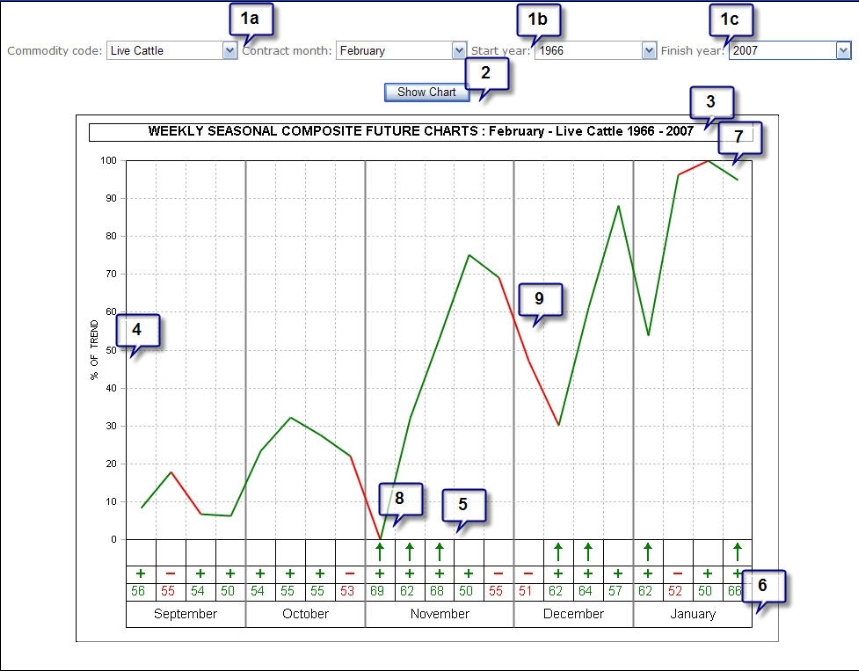
Here is a sample seasonal chart of February Live Cattle compiled over the years of 1966 to 2007. Each callout has a corresponding explanation below the chart.

- SETTINGS: To create a new chart specify choose the parameters for the chart from the list below.
- Commodity code and Contract Month (note that this is slightly different for Spreads and Stocks).
- Start Year: The first year of data that you want included in the chart (typically the first year of available data).
- Finish Year: The last year of data that you want factored into the chart (typically the most recent available year).
- SHOW CHART: Once you've chosen your parameters, click on Show Chart to draw the chart.
- DESCRIPTION: This line lists the details on the chart type including years covered and the contract, spread or stock which is plotted below
- % OF TREND: The left hand scale indicates a percentage gain or loss within the context of the average trend. The average trend has been normalized within a range of 0 to 100. A move up or down or 10 represents a 10% move within the range of the trend. Note that it does not indicate a 10% move in the overall underlying contract, spread or stock.
- PERCENTAGE OF YEARS UP/DOWN and ARROWS: These figures show the WEEKLY percentage of time up or down on a percentage basis, for the specific week number listed under the percentage reading. If the data plot (see #9) for a given week is UP from the previous plot, and the reading is +75%, for example, then this is an indication of upward seasonality. Percentage readings from +60% to +100% indicate reliable bullish Seasonals and percentage readings from -60% to -100% indicate reliable bearish Seasonals. Arrows up mark strong periods of bullish seasonality and arrows down mark periods of bearish seasonality.
Note also the following conditions:
- The market tends to move UP during this approximate week more years than it moves down; however, the usual down move is much larger than the net up move, thereby accounting for the down plot. Upside potential during such weeks may be small in PLOT IS DOWN and percentage reading is +60% or higher: This means that terms of magnitude although upside moves can be large.
- IF PLOT IS DOWN and percentage reading is -60% or more negative: This means that the market has moved DOWN 60% or more of the time for this approximate week during the years examined, and that the size of the decline during down years, is generally larger than the size of the rally during up years.
- PLOT IS UP and percentage reading is -60% or more negative: This is an indication that even though most years are down for this approximate week, during those years that were up, the moves were relatively large. If you sell short on this type of combination, then you may take a very large risk for a potentially small, but reliable profit.
- PLOT IS UNCHANGED (SIDEWAYS) from previous week: It is an indication that the magnitude, or size of the move for this approximate week, is in equal balance between up and down. This does not necessarily mean a sideways trend for the week.
Trend can only be determined by the accompanying percentage reading. If it is 60% or more, then you can expect generally higher prices. If it is -60% or more negative you can expect a down move. The sideways plot means only that the up and down moves are about equal in size.
- MONTH AND WEEK: We use an ISO standard to determine the number of weeks in a year and whether a month has 4 weeks or 5. The number of weeks in any given month, using Friday as the last day of a week, will vary from year to year. Sometimes November will have 5 Fridays, and other years it will have 4.
The weeks listed are reference points. As mentioned earlier, the last week in the chart is the last week of the month prior to expiration (for futures contracts). From this week we simply align all contracts and count “weeks back” from this final week.
- AVERAGE SEASONAL HIGH is indicated by the highest plot on the chart. This means that during the years under study, there has been a tendency for prices to hit their contract high for the given period around this week and/or month.
If a high is made during the last few weeks of a contract, then prices may move even higher several months thereafter, and the next contract month should be checked for this possibility.
If a seasonal high is associated with high readings in the percentage column, and if a subsequent move to the downside occurs with equally reliable readings, then this is most likely a highly reliable seasonal top.
- AVERAGE SEASONAL LOW: The same holds true for seasonal low, only in reverse.
-
PLOT: The major plot line shows the seasonal tendency for all years included in the chart. The green and red sections indicate whether the weekly price action tended to be positive (green) or negative (red) for the given week.
Next Topic: What To Watch For

